The assignment was to invent a “potion” and then design packaging that personifies the potion’s effects.


How might we design packaging that personifies the effects of a strength potion?
What are some elements of design that represent strength?
I then asked myself:
Bold and Solid Shapespowerful ImageryNegative SpaceAngular LinesMaterial SelectionMinimalismThick Lines and StrokesSymmetryContrastbold and heavy TypographySymbolismSize and ScaleRepetitionLayers and DepthDark and Rich ColorsTextureProcess
bottle doodle practice


Potion ideation


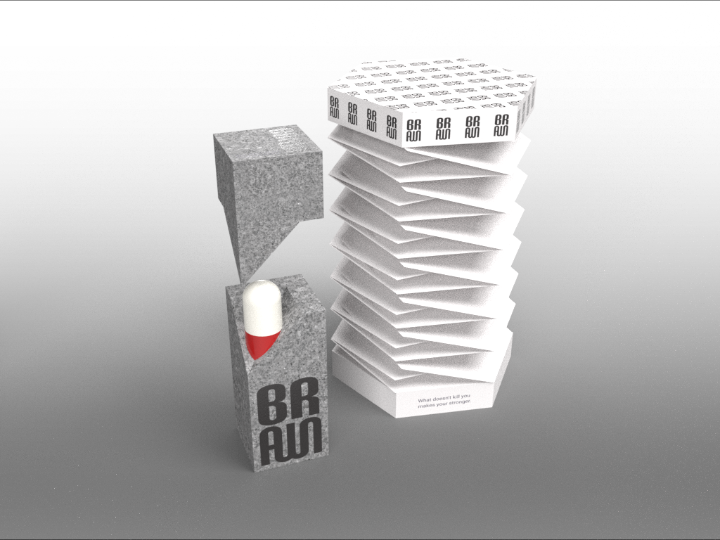
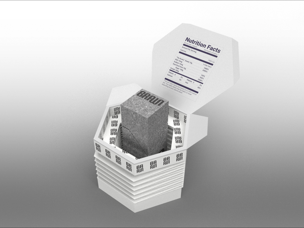
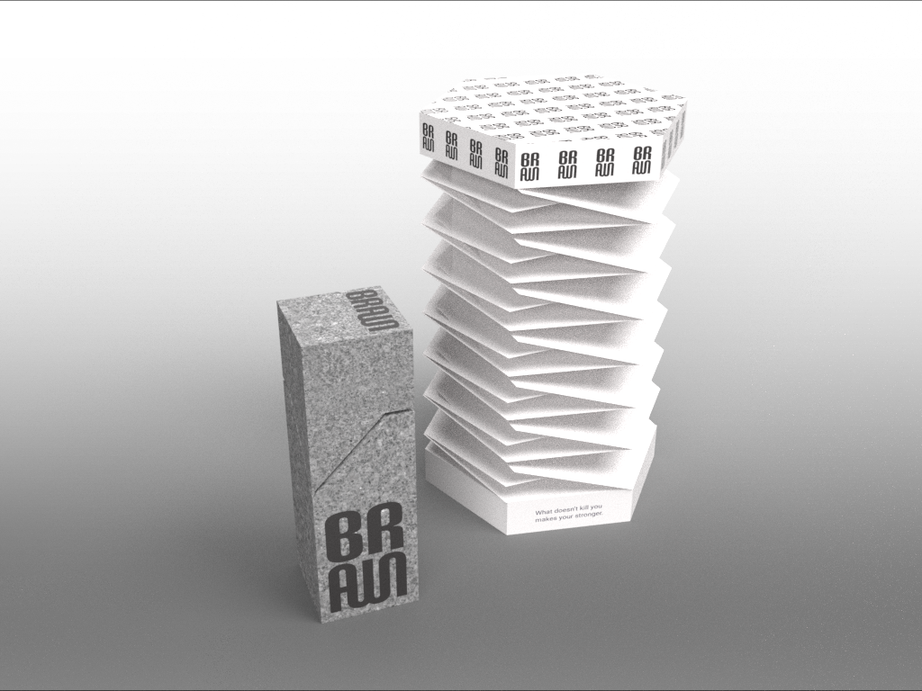
Strength Potion
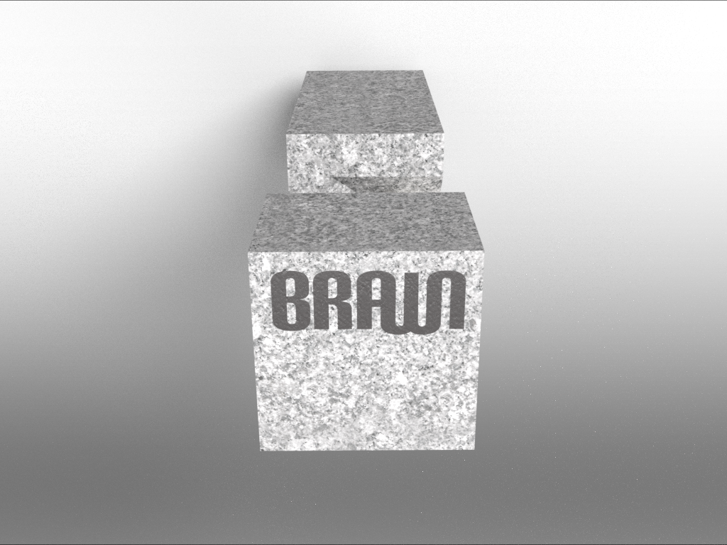
A capsule full of ingredients that would give the user super strength abilities. The capsule sits within a piece of stone.
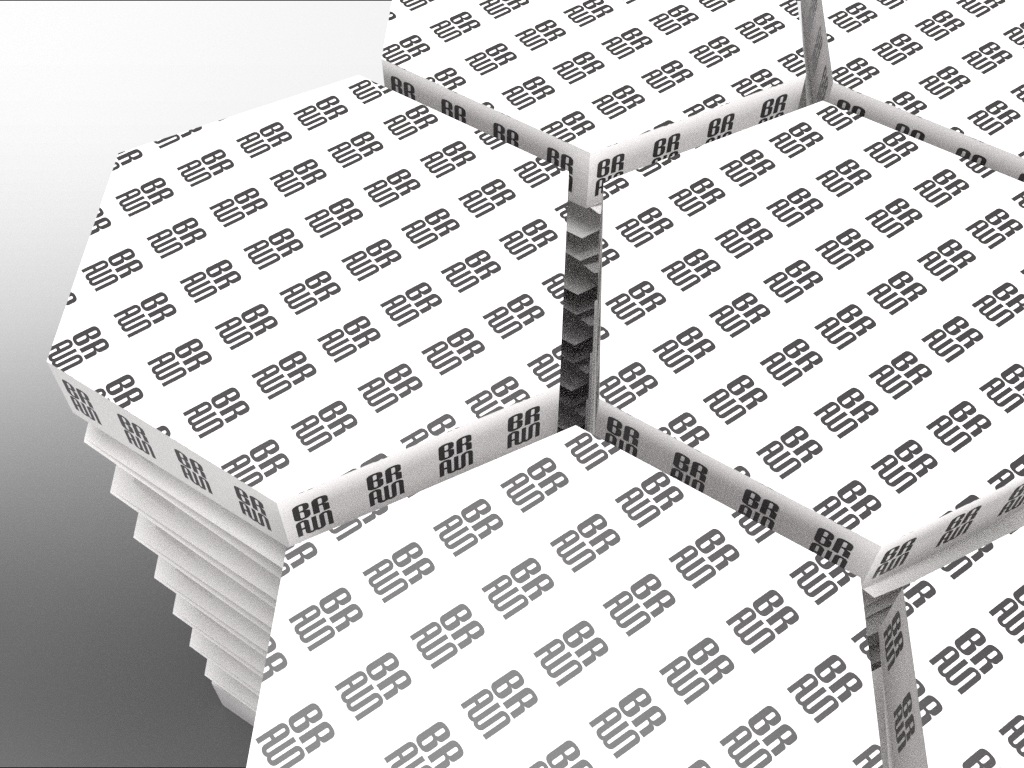
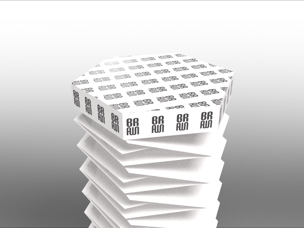
Packaging ideation


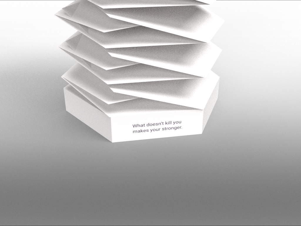
Origami + Stone Dual Packaging
My goal was to embody as many of the elements of design that I brainstormed above in my design, focusing on geometry, minimalism, and symmetry.
BrandingOption 1
I liked the connectedness and boldness of the font but the A-W combo gets confusing. Although, I knew I could do better.


Option 2Even though I didn’t go with this one, I still thought it represented strength the best, but I felt it was too masculine and military; almost expected.


The cohesion of the entire masthead is what drew me to this design. Even though the curves go against the original principles, it was a nice contrast with the packaging itself and that the boldness was enough to communicate strength.
Option 3 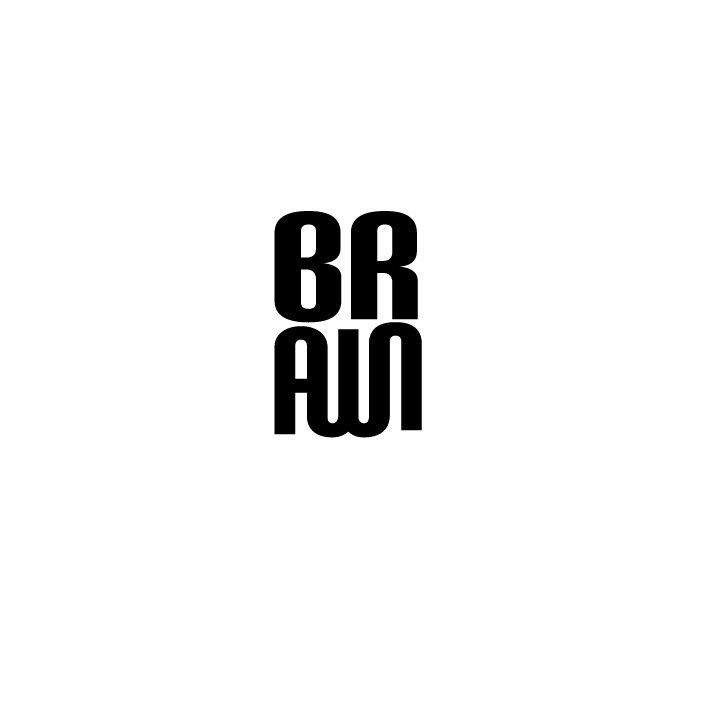


Final Drawings

Modeled in Fusion then brought to Adobe Dimension for rendering.